Panda bears,
I’ve been around this online marketing jam for a long ass time now. 16 years or so? I’ve brought in over $11 million online. I’ve coached tens of thousands of people to sell more online.
And I still see the same sales page mistakes, over and over.
So I’m going to write a list now, so when someone asks me to look at their sales page, I can spare my voice box and send them here instead.
And just to be super abundantly clear: you want to fix these mistakes TODAY. NOW. ASAP.
Because you are leaving shit tonnes of money on the table. Sales pages, without a doubt, are the biggest factor in your business’ success. It’s so so so so SO worth the time and energy to make it better. You will be rewarded. And by rewarded, I mean $$$$$$$$$.
And! This is now a podcast! FUCK YEAH! Delight your ears below:
Righto… on with the show.
Spot the mistakes you are making… then go fix them NOW!
1. You don’t have a sales page!
You’re just sending people straight to Amazon or your essential oil sign up page or the place people can buy direct from. STOP. DOING. THAT. SHIT.
You are wasting HUGE amounts of sales. Do not send people to another website to sell them. They will do a shit job of it. They’ll rock up to Amazon to think about buying your book, and they’ll end up distracted and order a 5 star vibrator and jumbo pack of Reese’s Peanut Butter Cups instead. I mean, you can’t blame them. What else were they supposed to do?
Instead, SELL SELL SELL them on your sales page first. Make it absolutely and critically clear why they need what you are selling. And then, and only then, link them to where they need to buy (if it is off-site).
2. I can’t find your buy now button
I’m stunned how many times I’ve gone to buy something on a website… and can’t find the fucking buy now button. Sometimes it’s hidden as a link. Sometimes it is a tiny button hidden somewhere. Sometimes it’s a little symbol. Sometimes it’s a little “Add to Cart” that then doesn’t take you to the shopping cart, and you have to careen around the page like an idiot trying to work out how to buy.
Stop.making.it.so.hard.for.me.to.buy.your.shit.
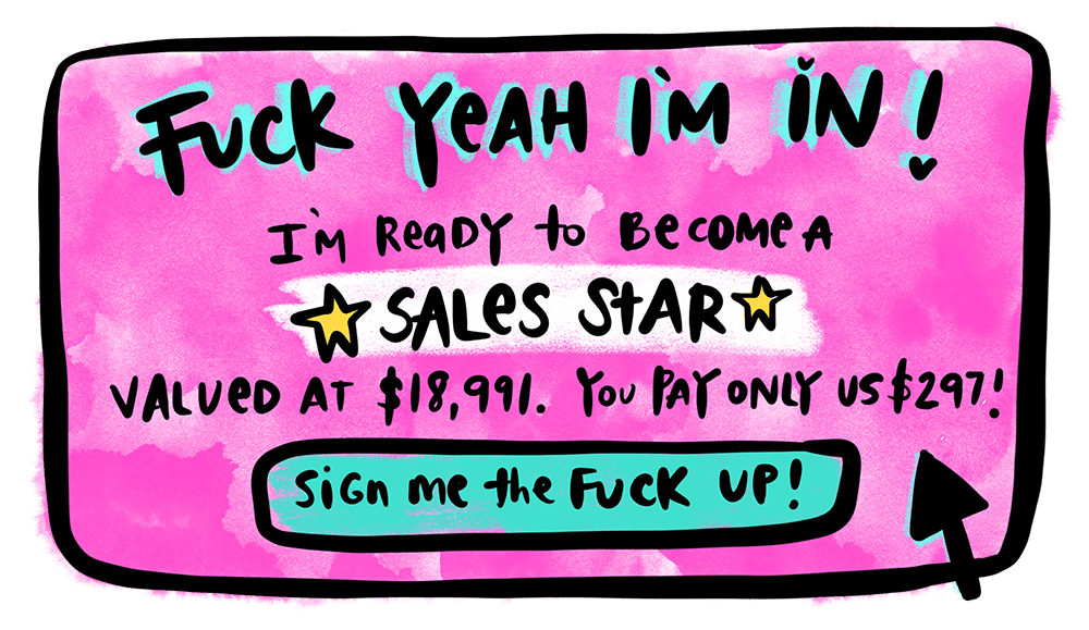
You need to have biiiiig motherfucker buy now buttons. Scattered throughout your website. As big and obtrusive as a donkey schlong. So much so that everywhere you look, you can see it. And you can’t take your eyes off it. It’s THAT compelling. THAT obvious.
When in doubt, donkey schlong it.
Example: A giant ole donkey schlong of a Buy Now button from my Sales Star page:
3. You haven’t shown me visually what you are selling.
Even if it is a digital product, or a coaching program, or a mystical invisible woo-woo machine… I need some goddamn pretty pictures, guys. I need mockups. I need an illustration of what I get. If it’s a physical thing, I need multiple images from every damn shape and angle. Well lit and bright. If it’s something that I’m supposed to wear, I need to see what it would look like on. And not just on some sad sack mannequin. GIVE ME SOME DAMN PICTURES.
Humans are visual creatures. We can process images faster and understand things far more comprehensively when it’s visual.
When in doubt, MORE PRETTY PICTURE PLS KIND REGARDS AND THANK YOU.
4. You have named it something so hippy nampy-pampy I don’t know what it is for
Hippies, I love you. You know that. I am one of you.
AND: I need us, collectively, to commit to NOT inventing word salads and being super creative with titles to the point that nobody else understands what the fuck we are talking about.
Your product name is NOT where you win prizes for most creativity. Save your creativity for what’s IN the product. Save the creativity for literally EVERYTHING ELSE except the title.
Years ago, I met a very sweet man at the markets who was an incredible healer. He was writing a book at the time. I asked him what it was called, and he told me the name. Then he had to spend the next 5 minutes EXPLAINING the name to me, what it meant, and what the book is actually about. Spoiler alert: if you have to spend five minutes explaining a name to someone, the name has failed it’s job. You can NOT do that for everyone who this book is for.
Your product name should CLEARLY tell me WHAT THE FUCK IT IS + WHO IT IS FOR.
If it doesn’t do that, you are losing a shit tonne of money. And you are not helping the people who it is meant for.
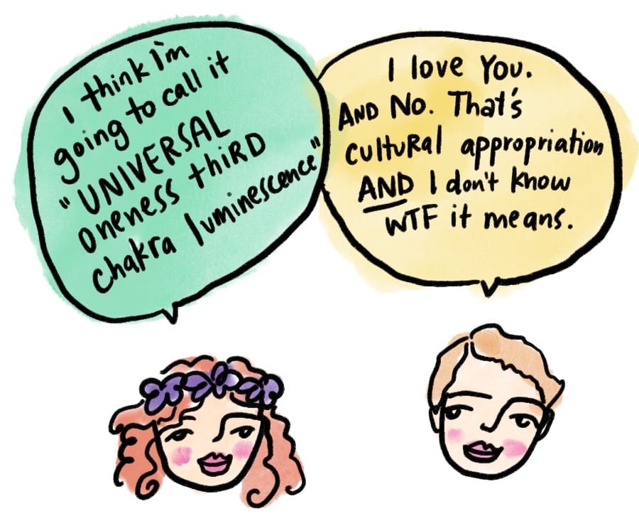
Also: As hippies, it’s super important we also make sure we don’t fall into cultural appropriation when naming products or teaching. I’ve absolutely made this mistake before, and I wish I had known better then. I feel like it is my responsibility to educate you and direct you to anti racism educators. Cultural appropriation is harmful to the Indigenous cultures we claim to love so much. It is not good business practice.
5. You behave like you are in witness protection
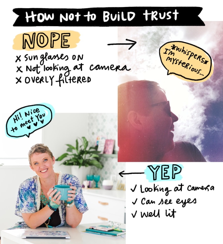
Have you forgotten to tell me who you ARE on the sales page? Is there a photo of you? If there IS a photo of you… are you wearing sunglasses? Are you looking away from the camera poetically?
If so:
are you in witness protection?
If you are – sure, hide your identity. Or make a new one up for the sake of selling online.
If you are not however:
Stop. Fucking. Hiding. I can’t trust you to buy something from you if I don’t know who you are. I am a human. We look for common signals to build our know, like and trust factor of a new person. I need to see your face. I need to see your eyes. It’s not about whether I want to bang you or not. It’s about whether I, as a human, can trust another human enough to give them $$$ and know I will be well taken care of.
6. Your sales page is not long enough to really convince me
I don’t even know why there is an argument about this.
Over and over again throughout all the ages, research and testing shows long form sales pages convert much better than short form.
So it’s really a question of money.
Do you like money? If so, make them longer.
If not, sure – make it shorter.
We need time (length) to be convinced and understand why we need to buy from you.
7. No compelling testimonials with faces on them
Humans need social proof that we are doing the right thing.
We want to know that other people have already used your thing, and loved your thing, and highly recommend your thing to others.
I once asked an expert copywriter what three parts of a sales page sold the most.
She said:
Testimonials.
Testimonials.
Testimonials.
Go check out how many testimonials on the 40 Days To A Finished Book e-course. They basically sell the course for me.
8. You haven’t told me who this is for
New phone, who dis… for?
Am I the right person for this product? Or no?
YOU TELL ME.
No. Seriously. Tell me who this is helpful for. And don’t say everyone.
Also: being very clear about who this is for and who it is NOT for is also really important for YOU to define your ideal client, and who you don’t work with.
For example, in my Money, Manifesting & Multiple Streams of Income course, I have this:

9. You haven’t told me how this will actually help me.
- What are the benefits?
- What will I feel like AFTER using your product?
- How will I be transformed?
- What does this HELP with?
For the love of Delilah, be clear. Tell me the answer to these questions.
Or I shan’t be sending you the cashy-cashola.
10. You are linking to everywhere else.
Hush now. I love a good link. We all do. We all like to clicky clicky all the linky linkies all day long.
But guess what?
Your sales page is not the place to send us all off on a merry goose change around the interwebs and never return.
NO! Your sales page has ONE purpose.
That is to get people to click the Buy Now button… and send you cash.
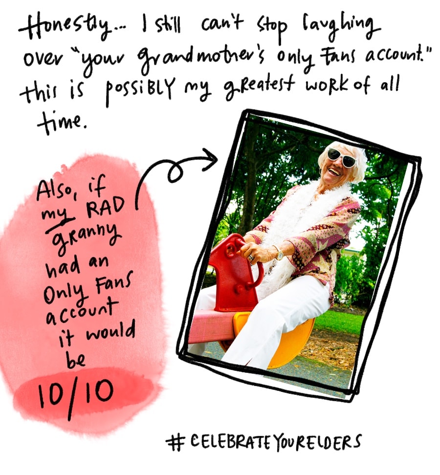
Don’t be linking me to your Instagram, or your grandmother’s Only Fans account.
Bonus point #11: if you’ve got my sales page checklist, I can tell if you haven’t used it.
If you’ve got my 40 Days To Create + Sell Your E-Course program, you have my original sales page checklist as a bonus. If you’ve already enrolled in the Sales Star program, you’ll be getting a new pimped-out version of my sales page checklist.
And when you’ve got it: MAKE SURE YOU USE IT. Tick every little fucking bit off of it.
But only if you want more money.
If you don’t… ignore, or just do a half-assed job at it. Then you can stay blissfully static!
The more you tick off the checklist, the more money you will make.
There’s a lot of money you’re leaving on the table.
It’s your time to start picking some of it up!
And if you haven’t already – make sure you’re joining me for Sales Star in March.
But only… of course… if you like money.
If not… RUN! RUN FAR AWAYYYYYY!
Big love & abundance,
FREE GOODIES:


COURSES:


